Subschool Member Support web page
Project Details:
Tools used: Figma, Miro, Illustrator, Procreate
Client: SubSchool, non-profit
Timeline: 4 weeks
Project Brief
I and three other UX Designers worked with Subschool, a nonprofit organization whose mission is to support the substitute teacher experience. We worked directly with our client, Jessie Weiser, COO. Our goal was to create a member support website that is accessible to all tech-literate users and is easily maintained by a small team.
Design Problem
SubSchool is was a new platform, released in the Summer of 2021, and needed a member support resource page to help members who might need help navigating through the platform, joining webinars, and downloading software.
Design Audit of SubSchool Platform
Through a design audit of the Subschool website, we broke down the SubSchool platform pages and studied user flow to gain a better understanding of the platform.
This helped us establish the groundwork for the help page implementation and placements. From there We looked at the current content that SubSchool had an identified the main categories that members would require tech support in. We then categorized the information that into “My Account, Self-Paced Courses, Webinars, Small Group Classes, and Tracking My Development”. These became main components in the support navigation bar. From there, we brainstormed questions that members might have. We found that all the questions built onto one page along with previews give just enough information to the users so that they have an idea of the information they’re looking for.
Comparative Analysis
We compared help/customer service features on multiple similar platforms to SubSchool.
This resulted in a comprehensive understanding of the features help support has and how they affect user interaction with the website.
Stakeholder Interview
We interviewed a stakeholder to get a sense of task expectations and goals. We learned that substitute teachers come from a broad range of experience spectrum and they don’t reach out for support.
Sketching Exercise
We brainstormed multiple design versions of home, categories, transition, and article pages. After our team established what pages needed to be built, each team member took one page and made 4 different versions of that one page. We then conducted a critique of all the screens to determine the 1st set of wireframes to show the client.
This allowed the team to understand what might this support website look like and the different ways that this could be visually represented.
Wireframes
We created screens from the initial sketches after an internal design critique.
From the sketching phase, we each went back to combine the components from different screens that we liked to create one cohesive flow.
Pages we designed:
Subschool page that showed a transition to the support website
Home page
Category page
Article page
The wireframes were shown to the client in the second week which allowed us to get the feedback we needed to move to higher fidelity.
Low- fidelity prototypes
High- fidelity prototypes
Individual Contribution
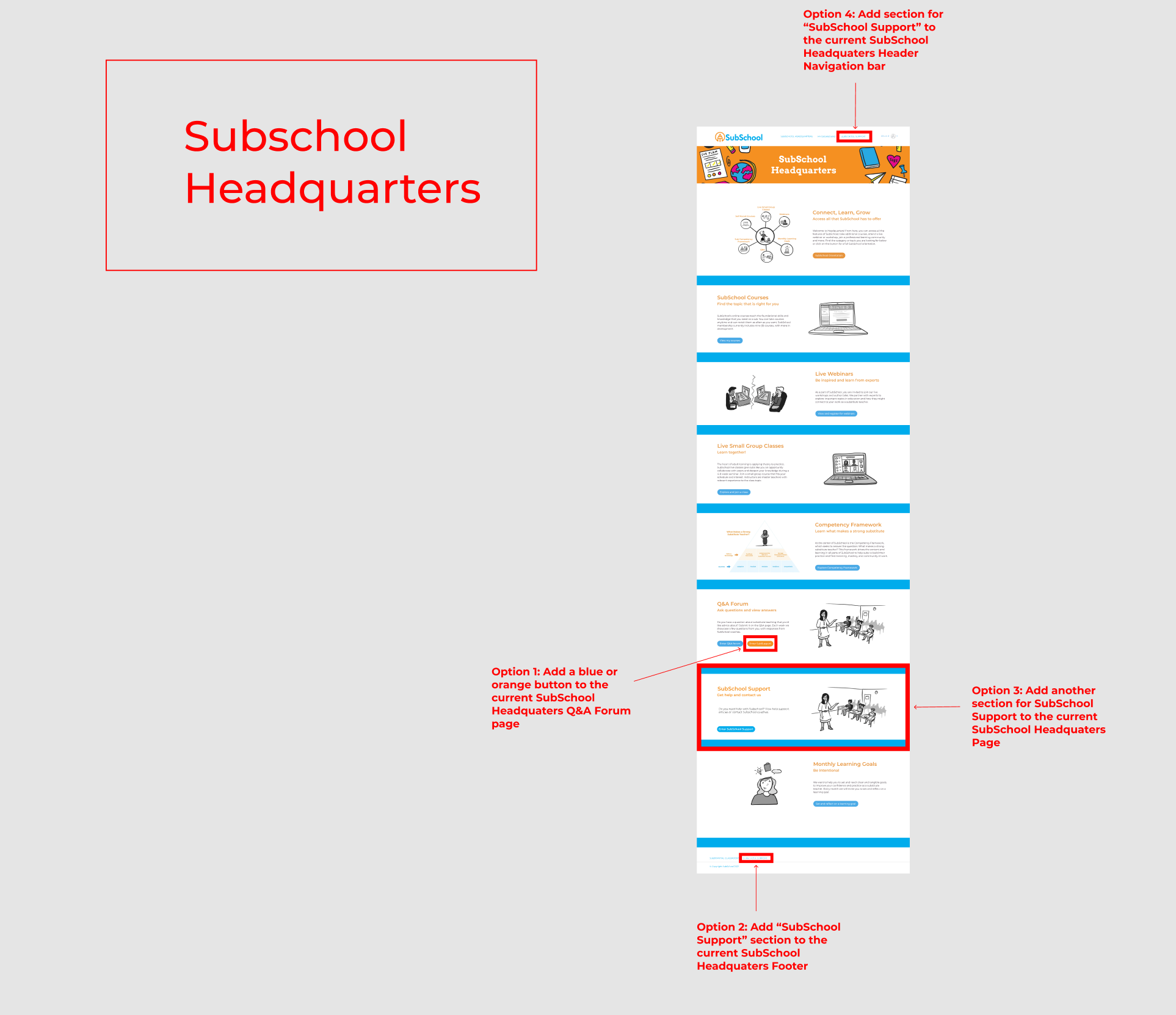
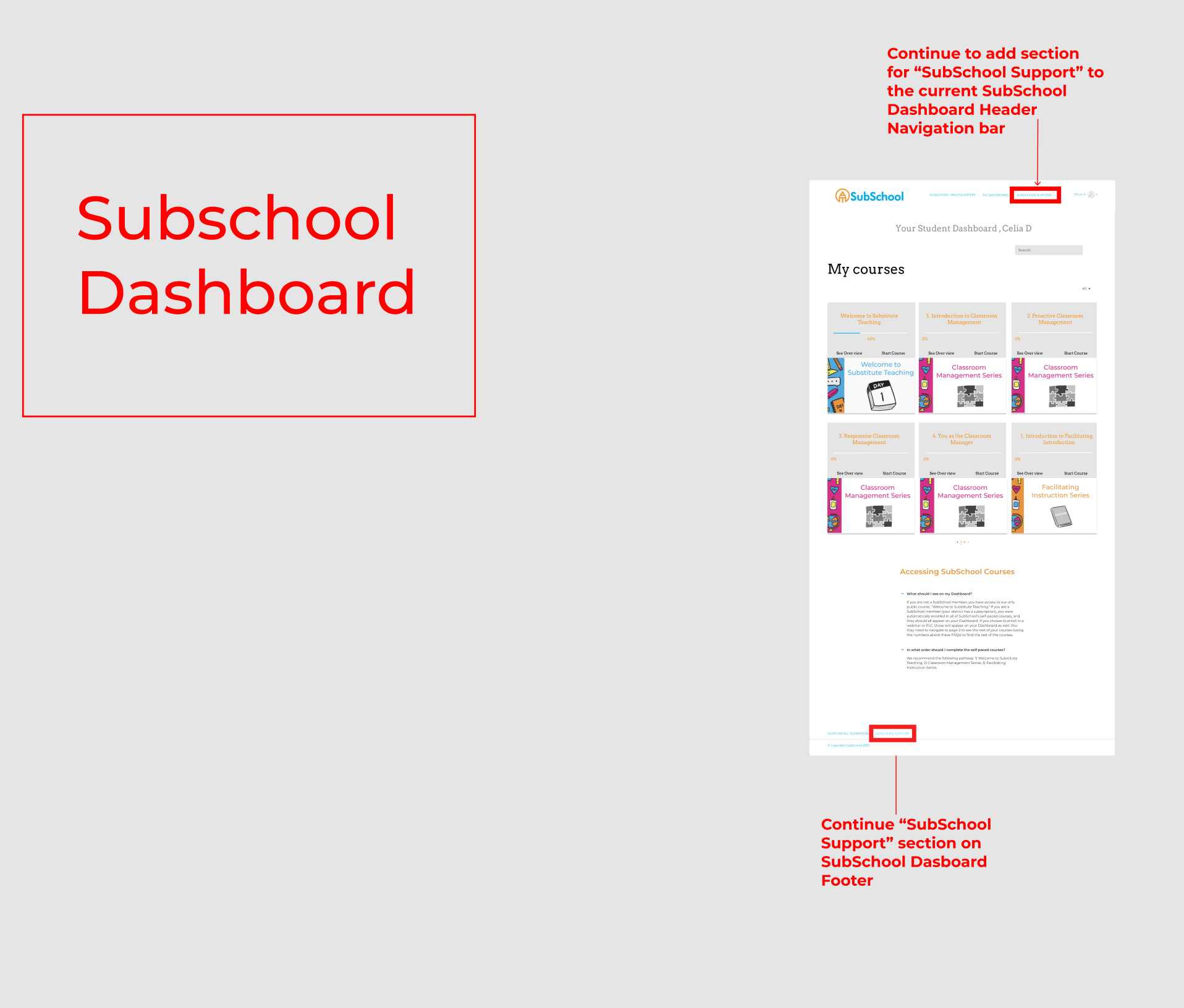
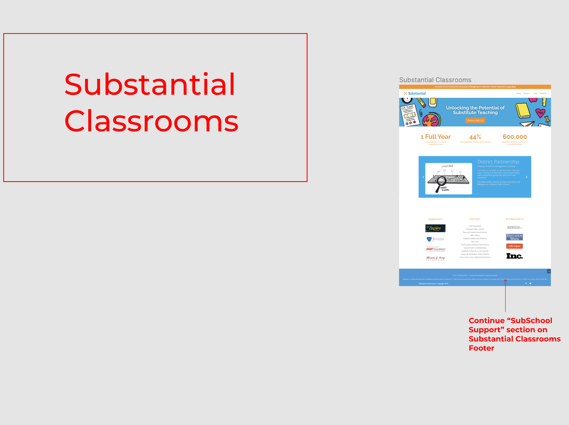
For this project, I was responsible for the transition feature. I focused on the transition from our client’s current Thinkific platform to our newly designed SubSchool member support site. These wireframes with annotations in red were created to help our client decide where to best incorporate the marrying of their current Thinkific website to the customer support page my team and I designed.
Taking our client’s feedback into consideration, the design decision we made was to incorporate the “Subschool help” link to the footer navigation because our client preferred maintaining the simplicity of the header navigation bar.


Project Learnings
We created a customer support page that is accessible to a diverse range of SubSchool user member’s by categorizing common questions into six categories; My Account, Self-Paced Courses, Webinars, Small Group Classes, and Tracking my Development.
Our journey exploration allowed us to discover an easy way to manage user feedback by incorporating a google survey into our design to allow the small SubSchool team to obtain quick feedback in order to better support SubSchool users in the future.
Our team designed an “Exceptionally Beautiful” design per our client’s personal request that is not only aesthetically beautiful but is also visually connected to the Substantial brand.


